LUCIRA HEALTH
Get to better, faster.


Welcome to the dawn of a new day


LIGHTING THE WAY
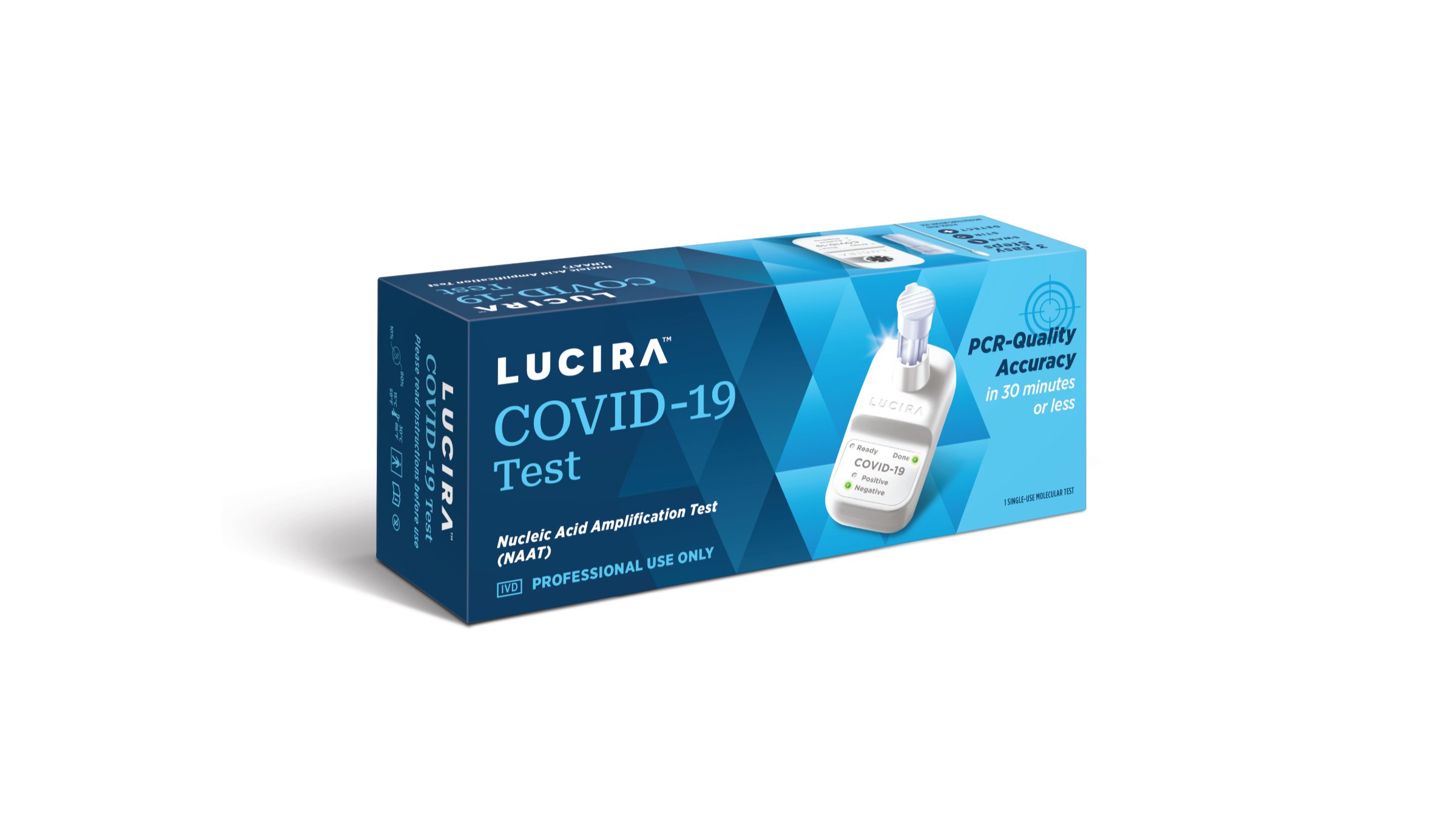
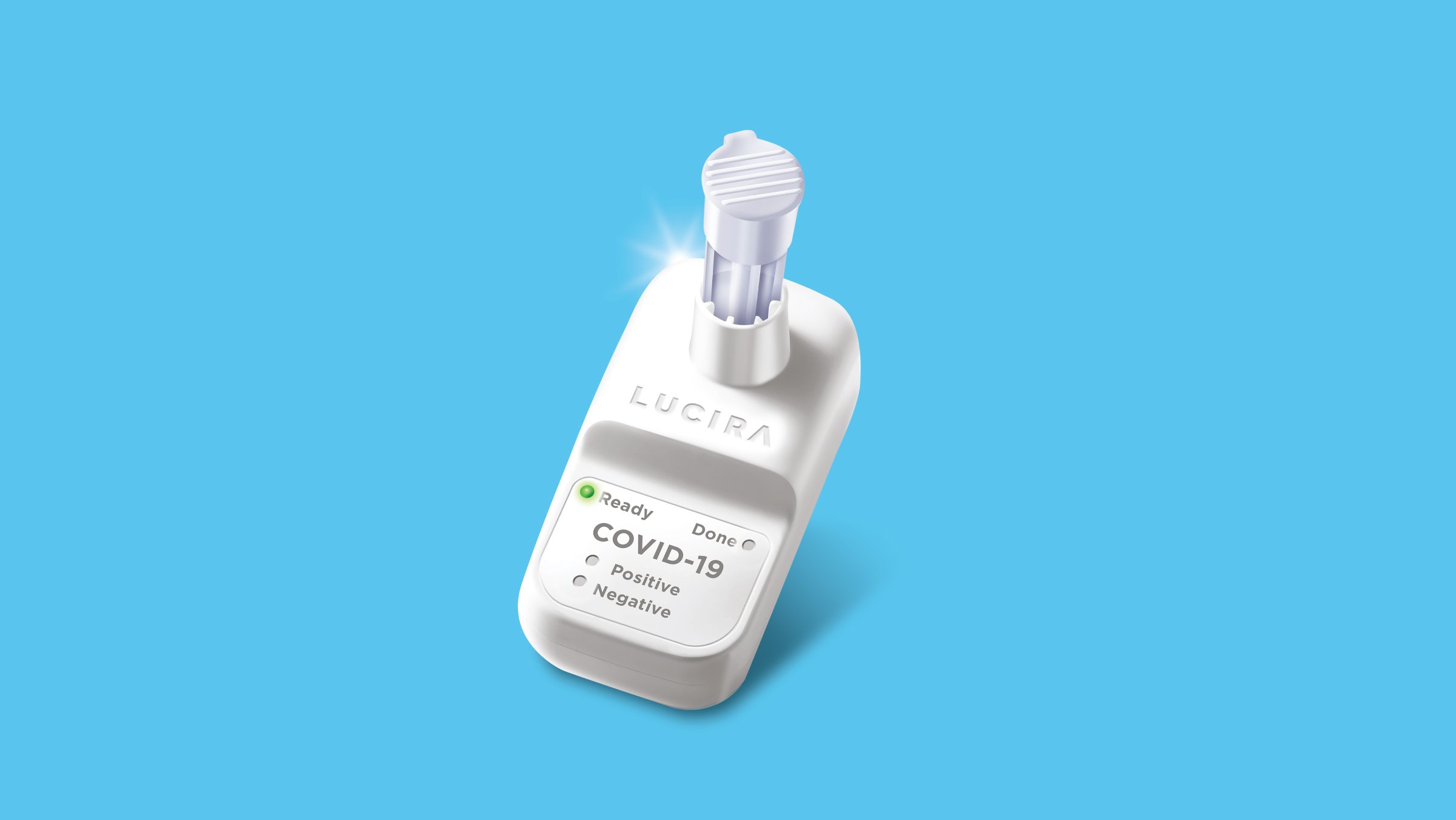
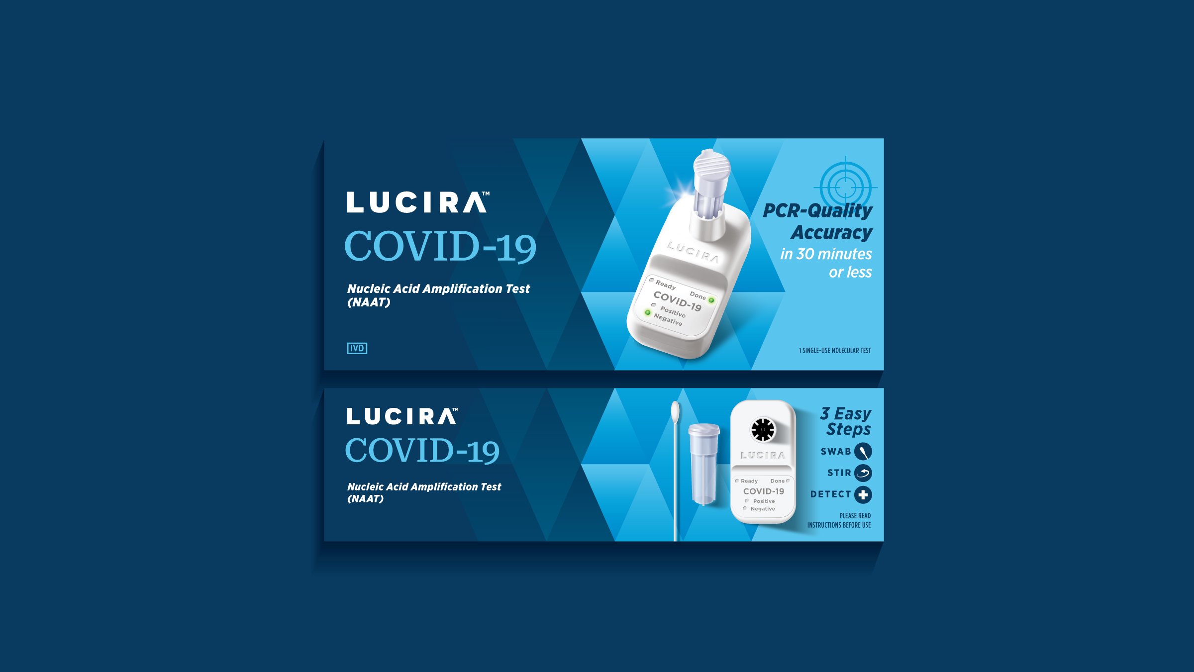
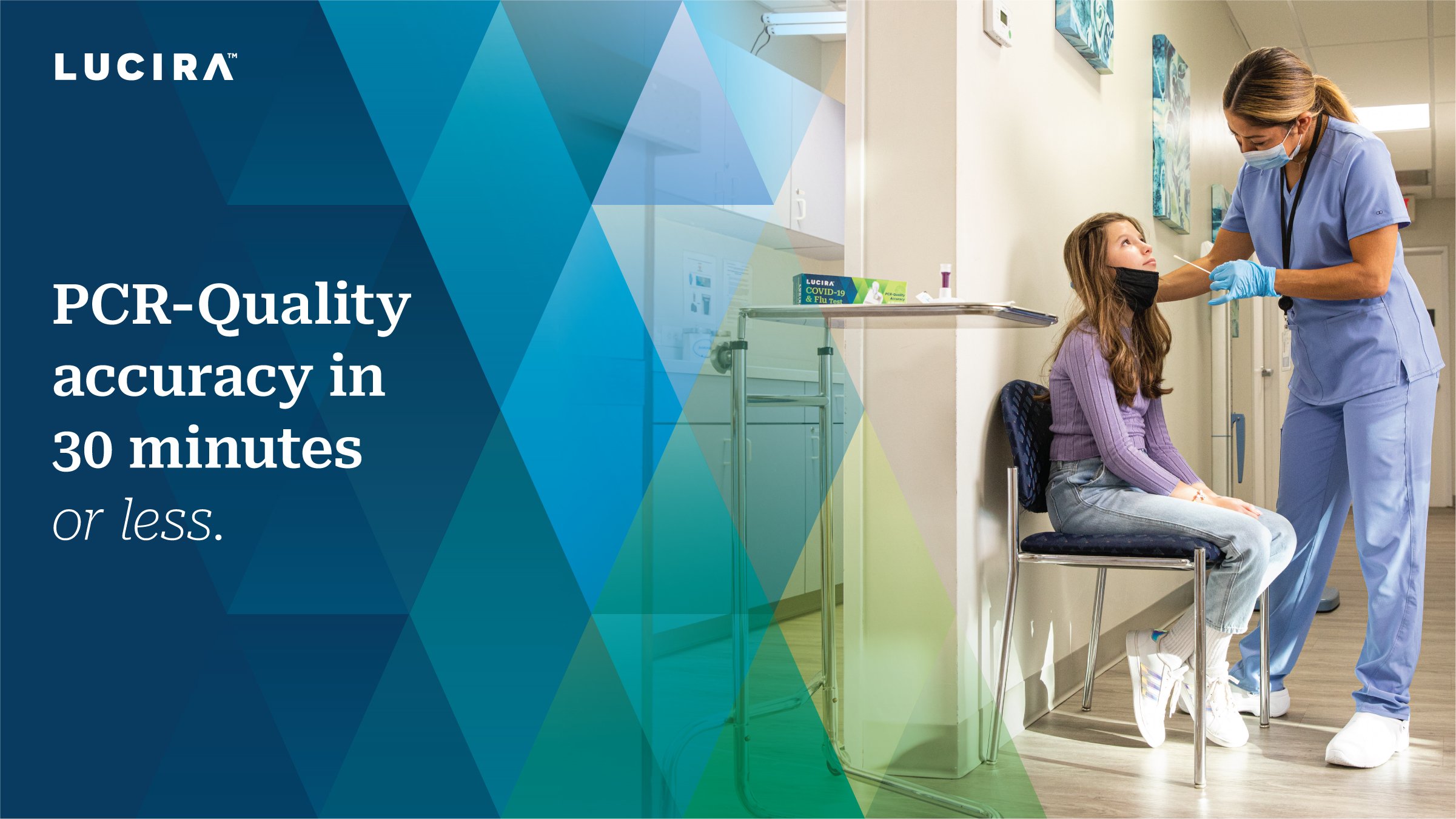
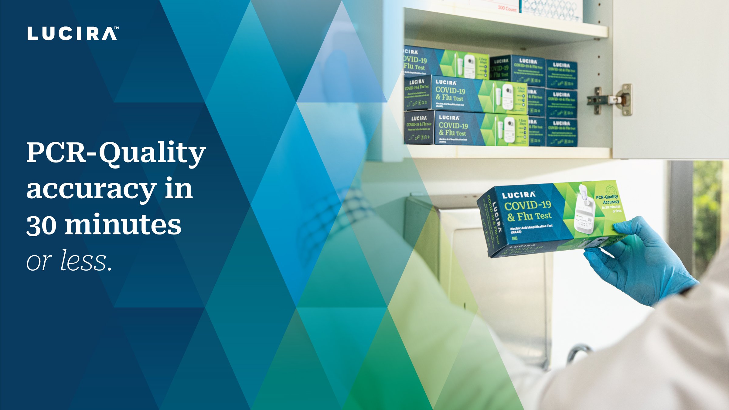
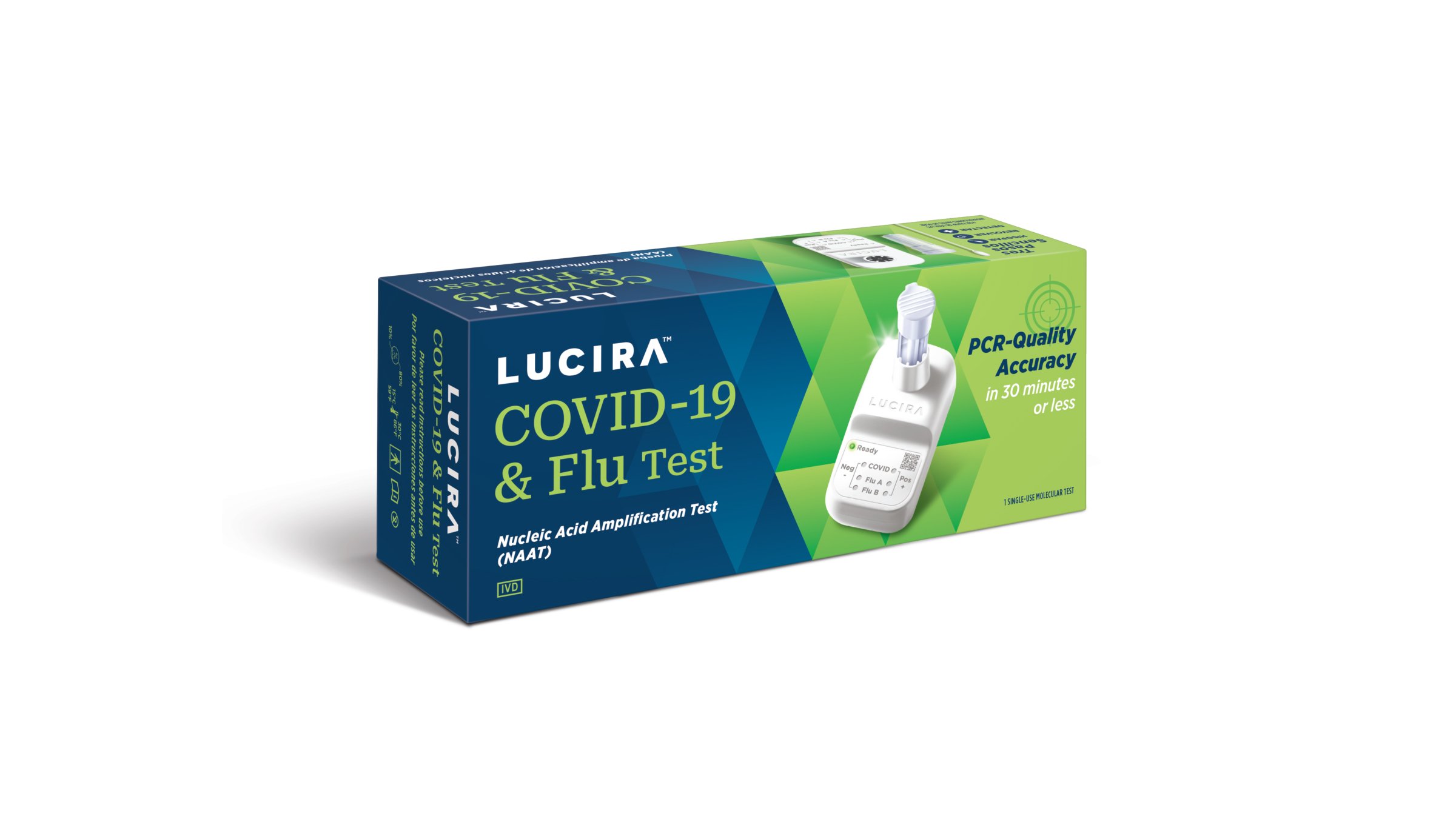
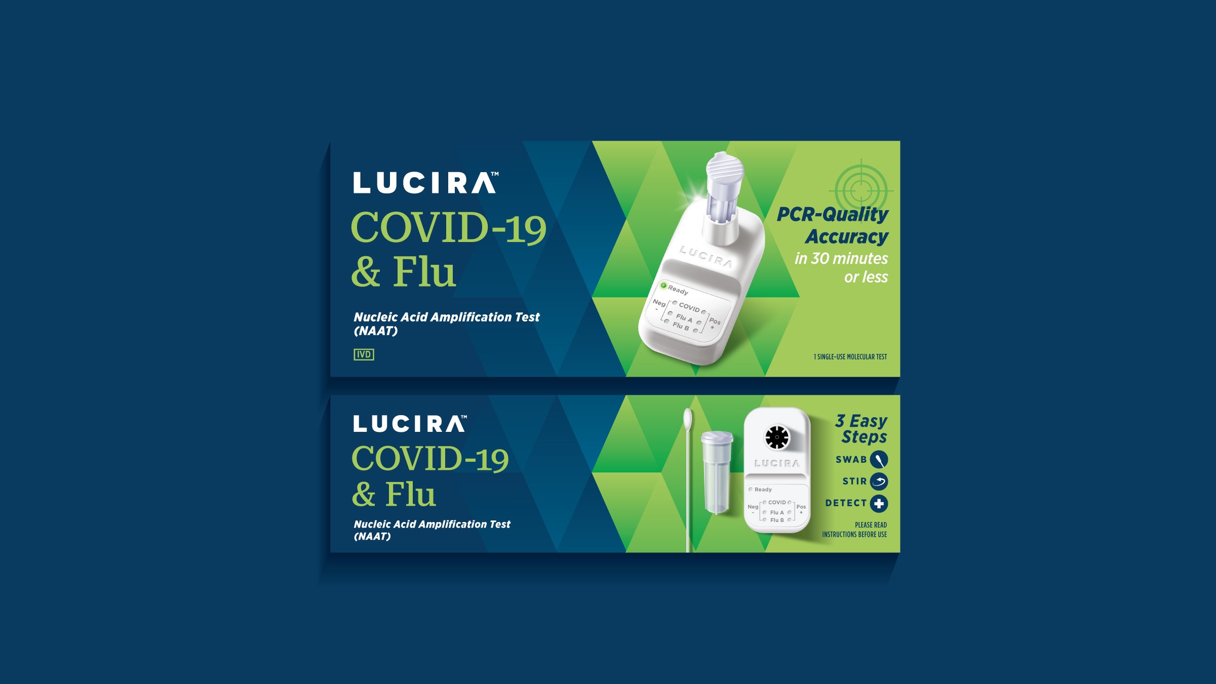
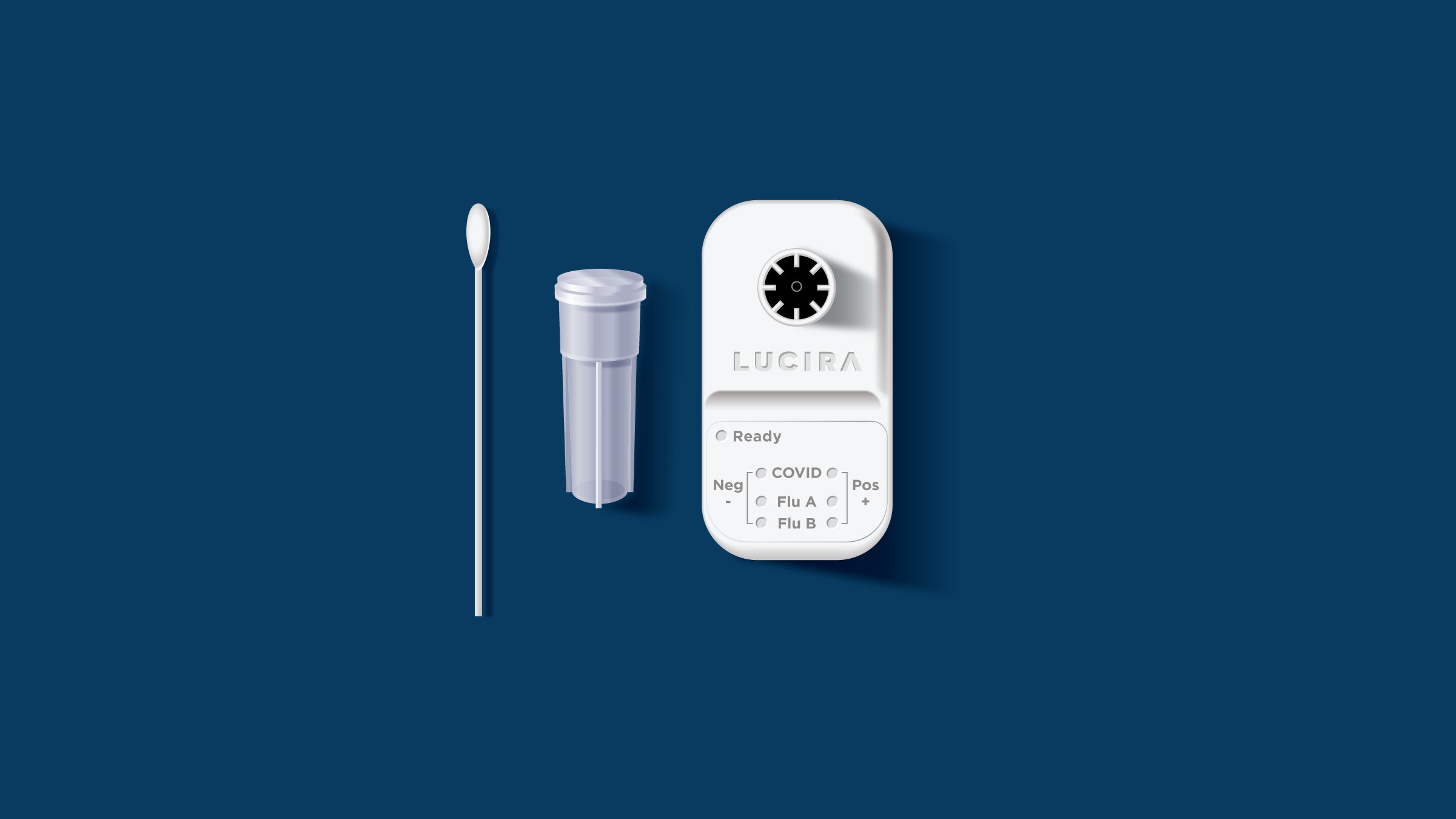
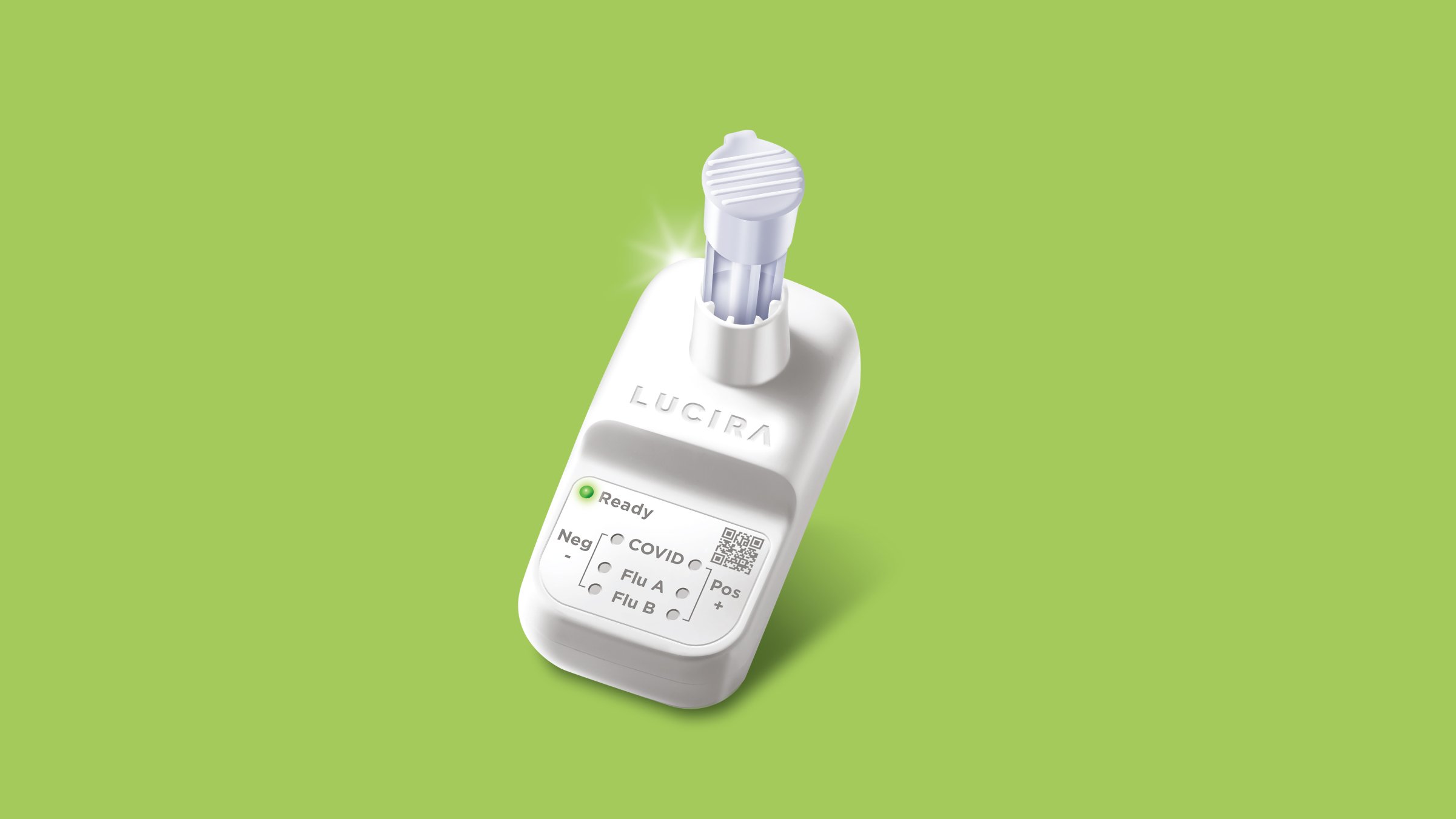
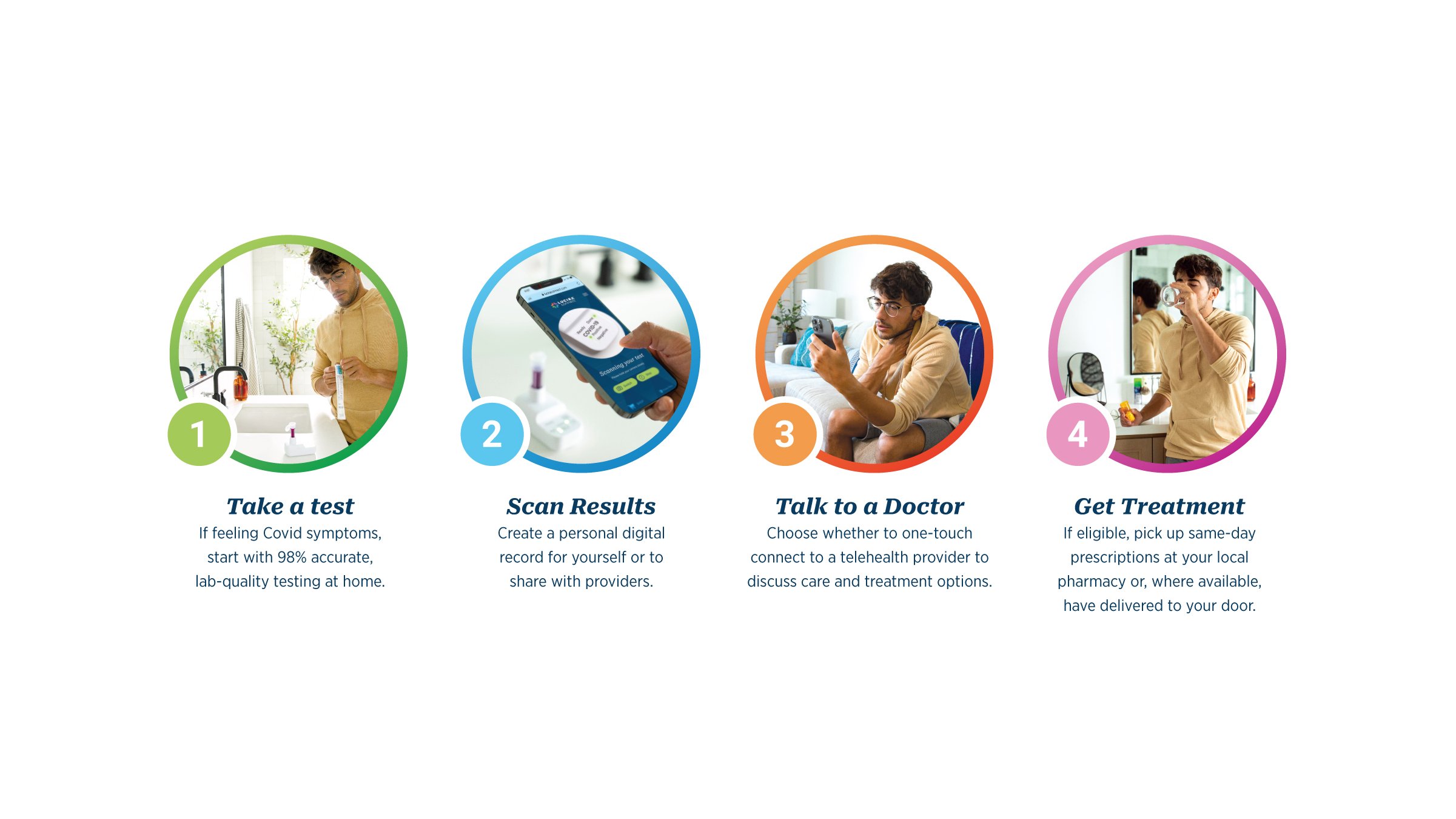
During one of the darkest periods in recent human history, when the global population was in desperate need of answers that provided illuminating clarity, our friends at Lucira Health had an exceedingly bright idea – to focus their efforts, and cutting edge technology, on helping people find unmistakably accurate answers as quickly and conveniently as possible. The resulting device was a NAAT (Nucleic Acid Amplification Test) that could deliver 99% accurate results in 30 minutes or less and fit in the palm of your hand.
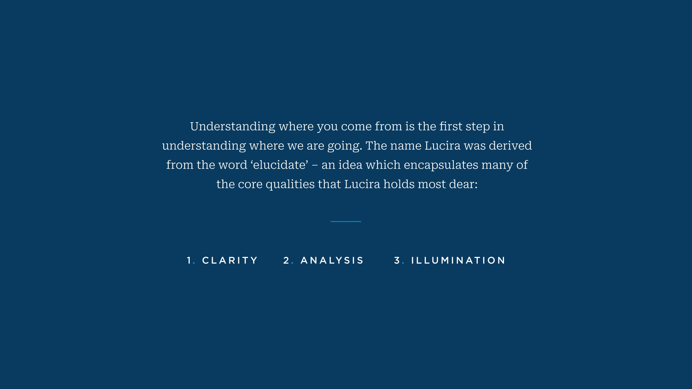
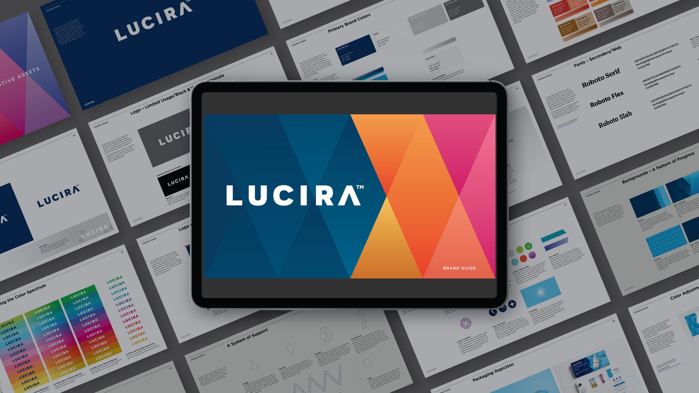
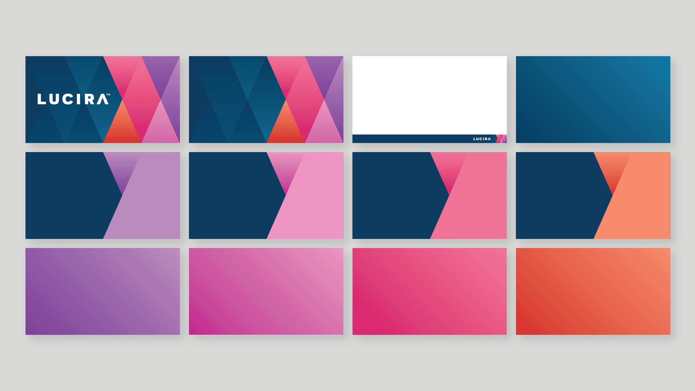
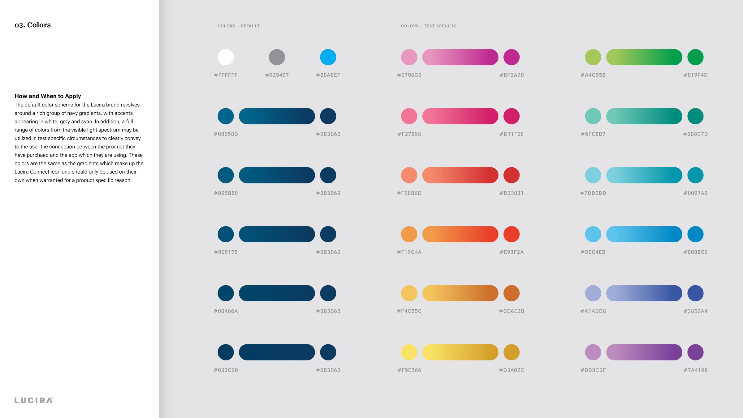
To ensure that Lucira’s image lived up to their enlightening mission, BAKER quickly went to work creating every branded touchpoint under a unifying visual strategy that aligned with the brand’s core beliefs, values and key benefit of helping people ‘get to better, faster.’ As the Lucira name is derived from the idea of ‘elucidation’ – making something clear by shining a light on the subject – and their innovative tests are activated by light as well, our team used these powerful connections as the ‘guiding light’ in our overarching theme. The new look and tone of voice now beam with the same brilliance as the Lucira devices that empower consumers to know their results with certainty, seek appropriate treatment, and utilize the free Lucira Connect telehealth platform with the goal of moving forward, faster — or you could say, virtually at the speed of light.


THE FUTURE LOOKS BRIGHT
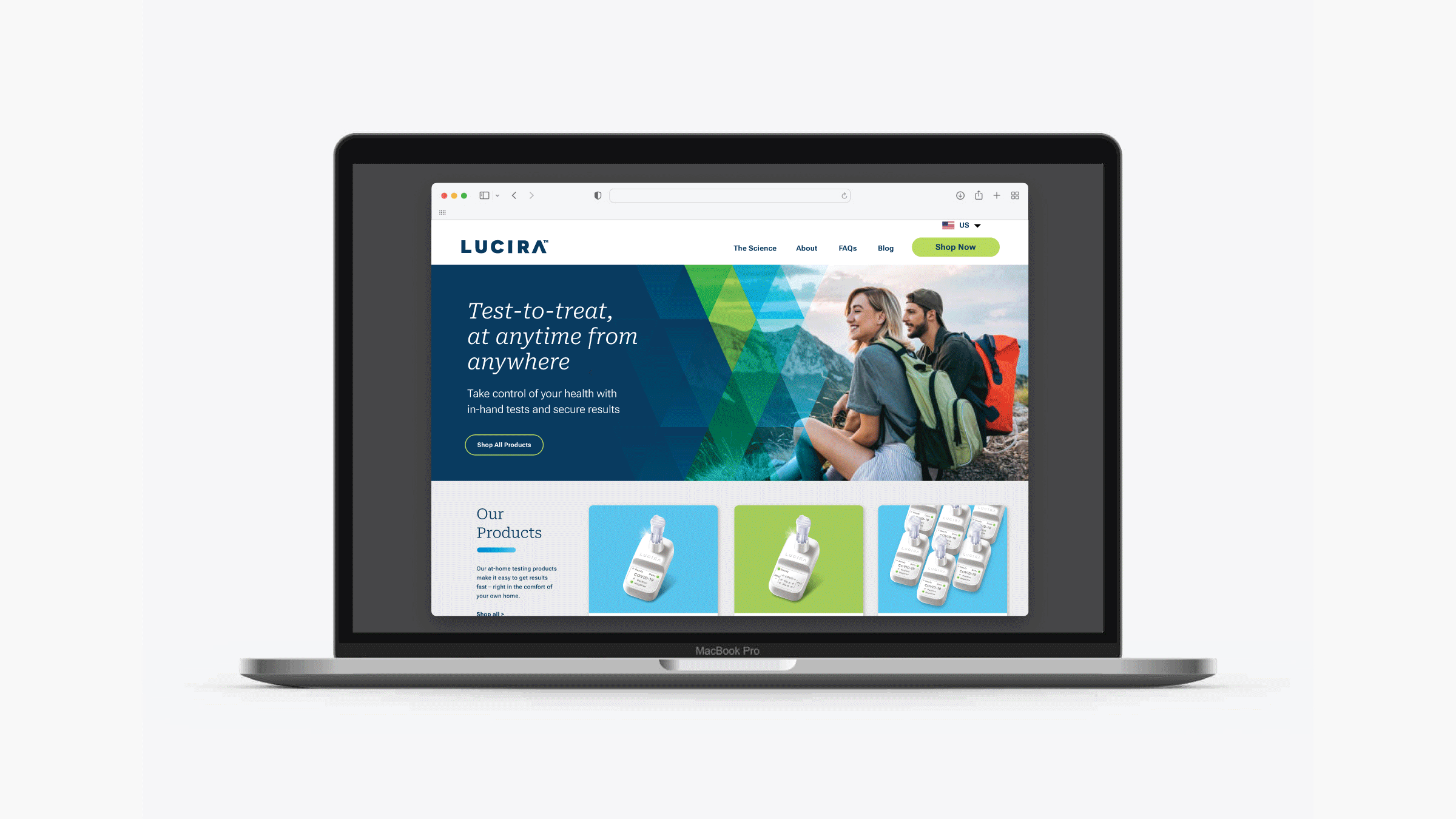
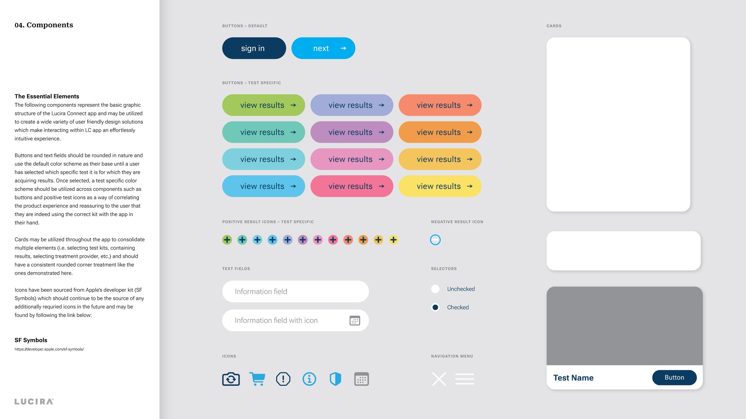
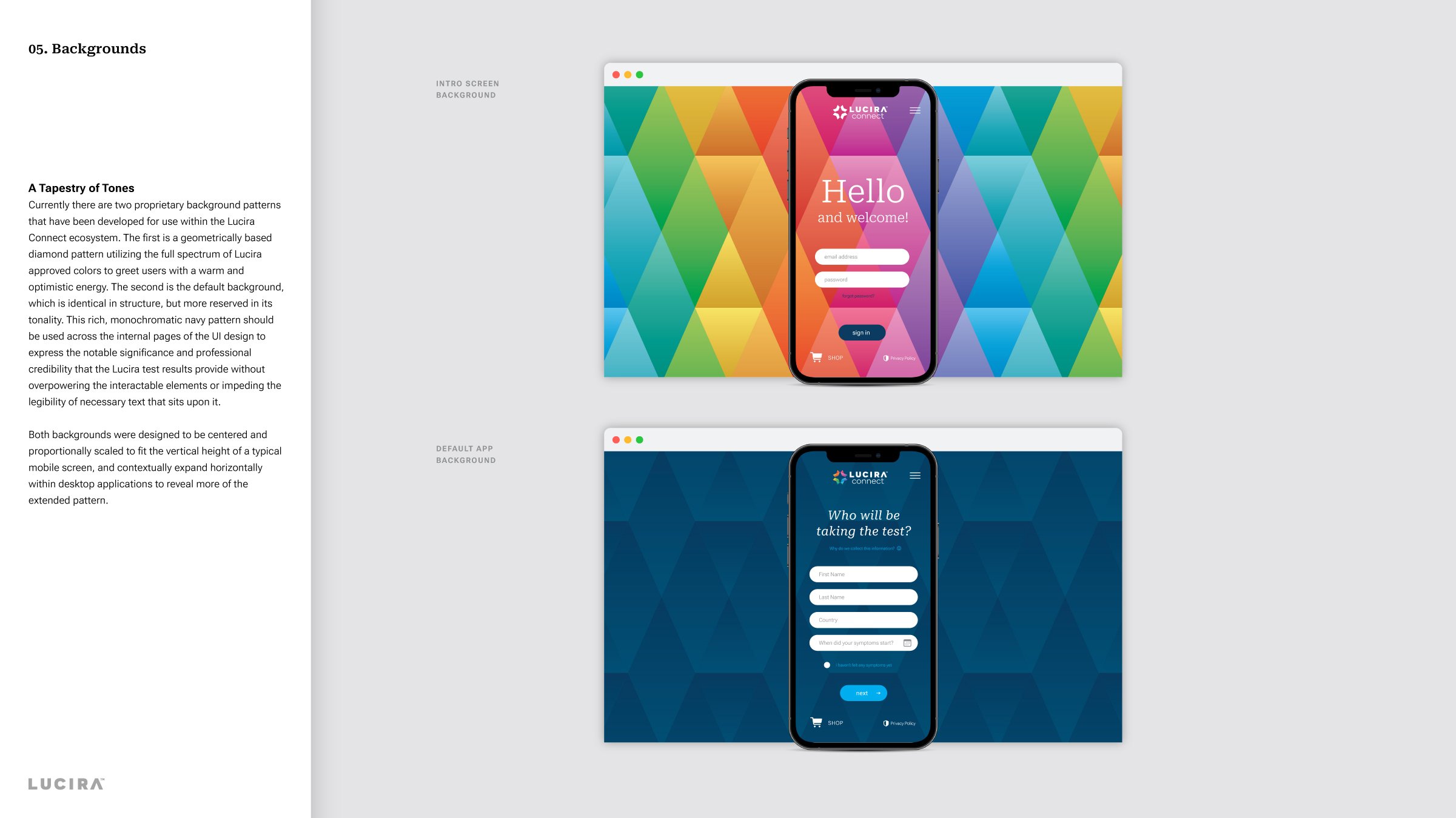
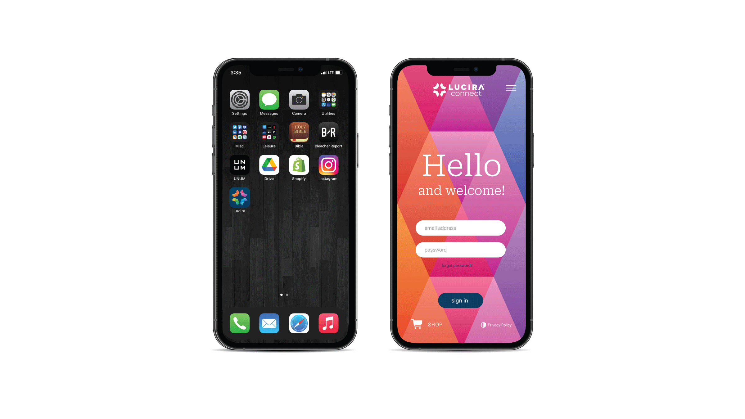
Following the initial brand development work, our team was tasked with extending the Lucira brand across a wide variety of touchpoints. From retail point of sale displays, marketing collateral and web design to the UI design of the Lucira Connect app, every element was infused with the same thoughtfully consistent considerations, ensuring that the brand’s colorful spirit and incandescent outlook on life shined through in each illuminating detail.


Related Work