
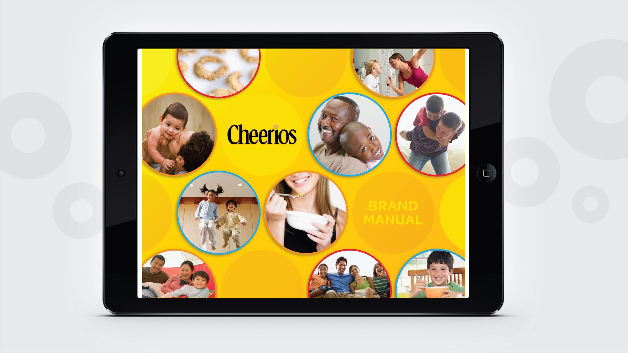
CHEERIOS
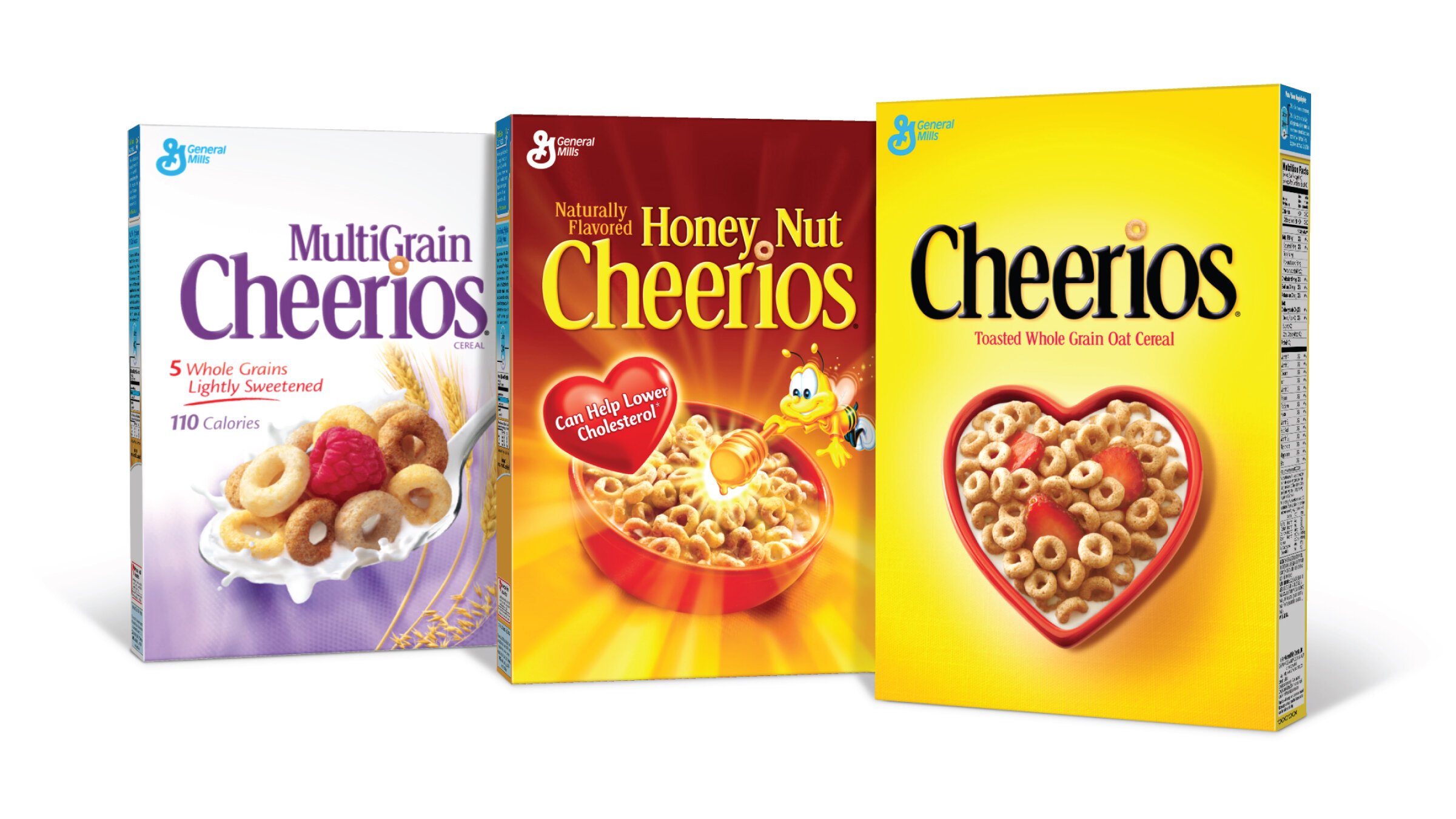
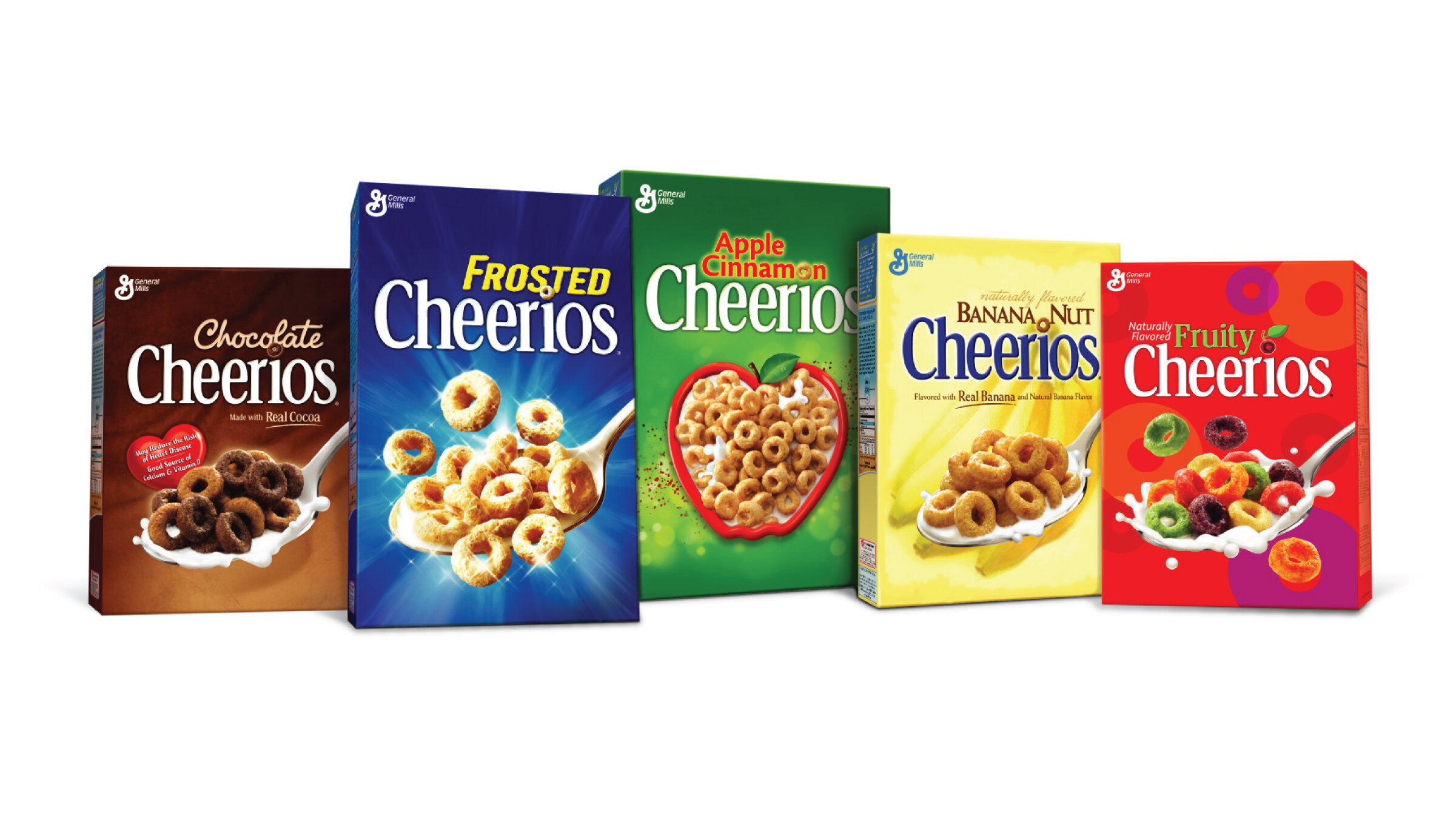
Taking a “franchise approach” to our redesign of the Cheerios portfolio resulted in a simplified, more impactful and consistent look to General Mills’ heavy hitting cereal line-up.
CHEERIOS CEREAL / GENERAL MILLS
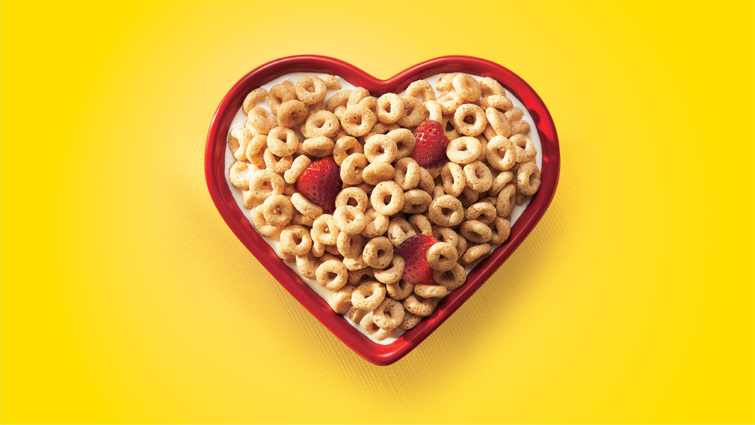
By unifying all brand marks, product positioning and placement, and key news areas on the package, consumers were led to have a richer brand experience. Through this strategic and thoughtful redesign, BAKER created the opportunity for a Cheerios brand destination at shelf.


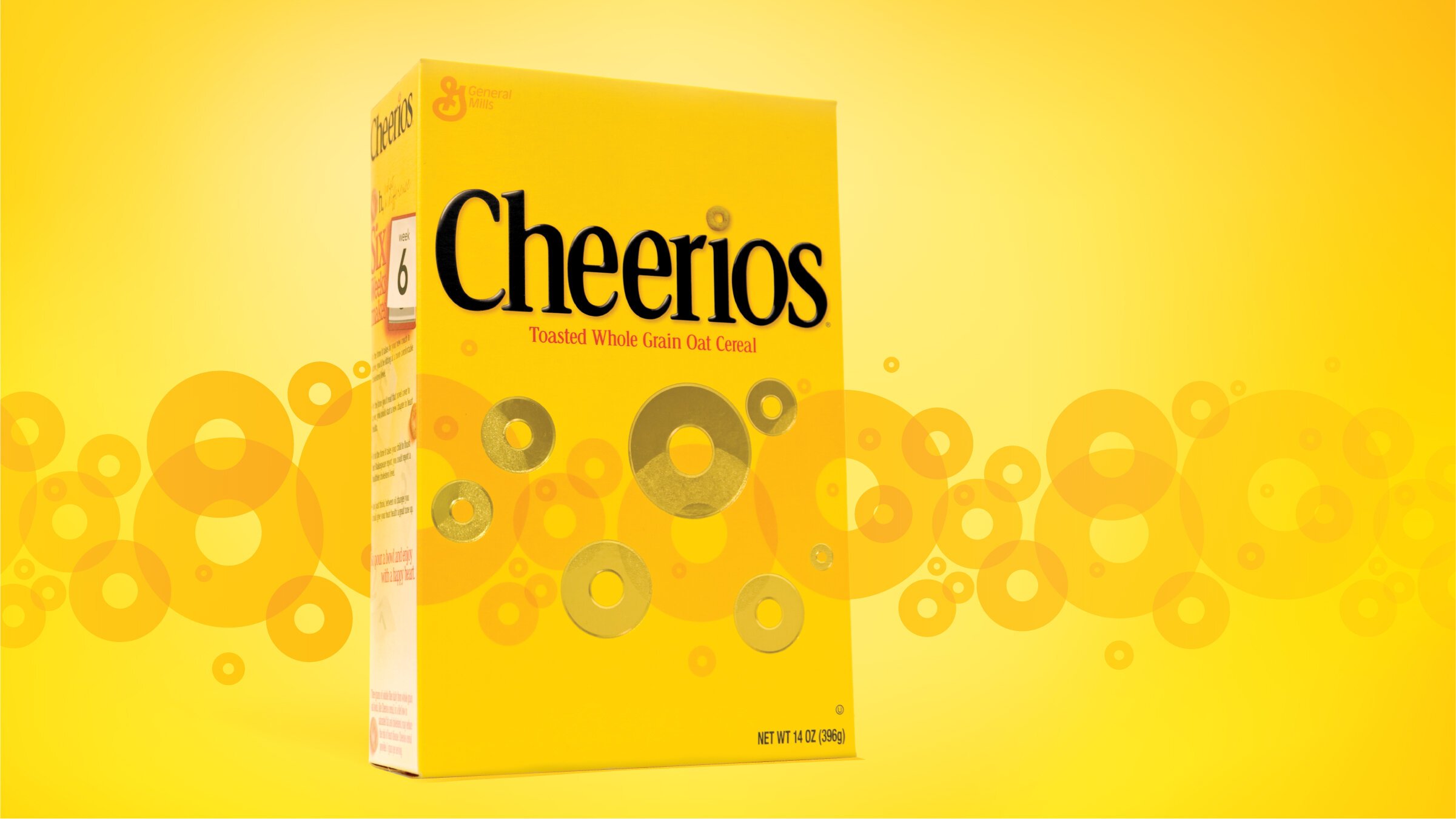
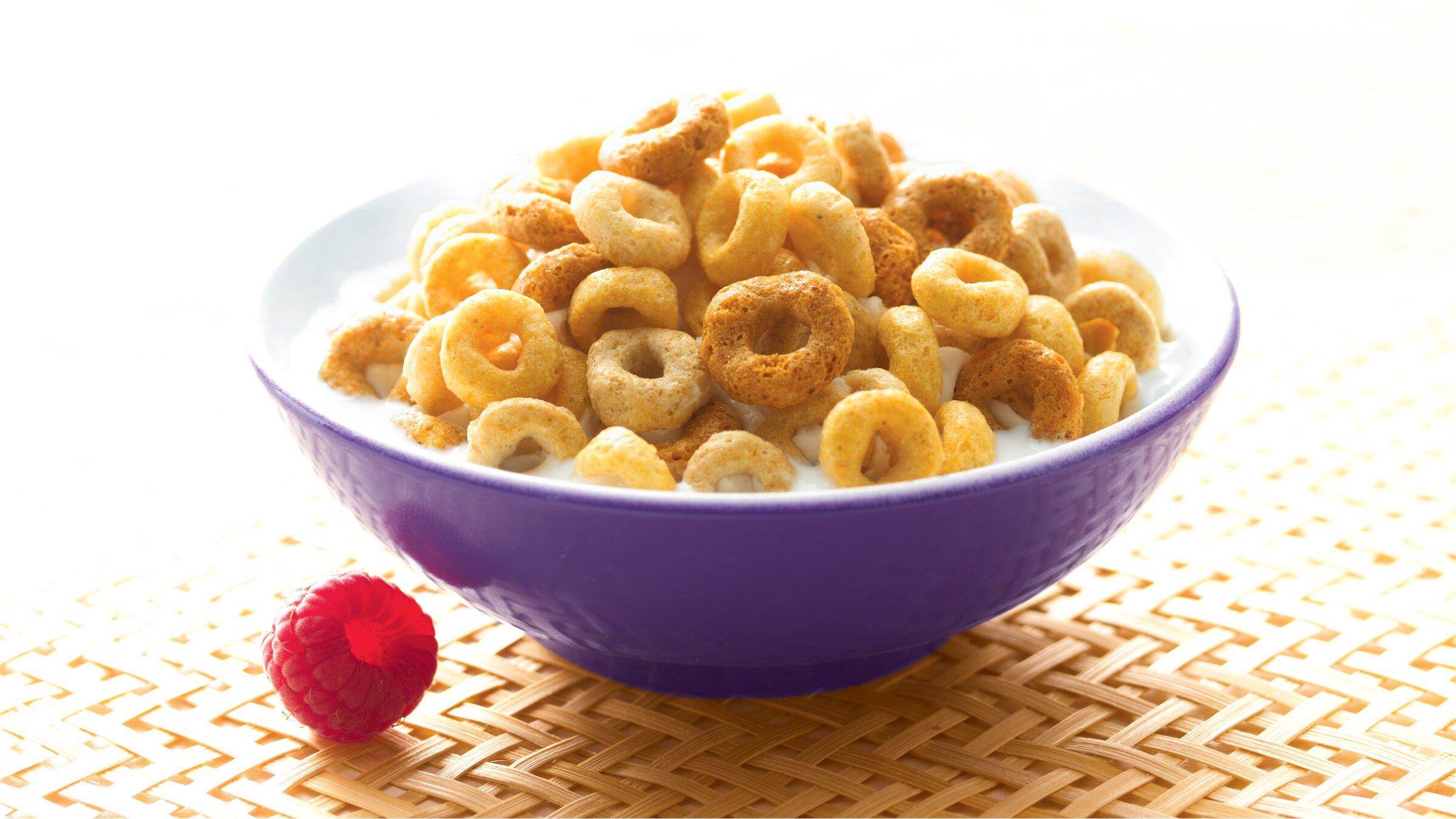
The one and only logo.
Prior to BAKER’s redesign of the entire Cheerios portfolio, each flavor variety had developed a slightly different iteration of the Cheerios logo over time. Only by taking a step back, and with careful consideration given to each letterform, were we able to unify the brand under a singular, cohesive mark.
Related Work


We have been named one of the Best Graphic Design Companies by DesignRush!