A BAKER CASE STUDY
5 GUM
Inventing an icon. Reinventing a category.
Wrigley’s had been feeling the pressure from competitors who were making pellet gum the new cool, so Baker teamed up with the internal design team at Wrigley’s and set out to make 5 gum the new black.

THE CHALLENGE
“Make stick gum cool again.” That was the charge Wrigley’s brought to Baker before launching of one of the fastest growing brands in the company’s long and storied history. Simple, yet audacious, and anything but easy… it was just the kind of challenge we love to dive into head first.


BRAND.THINK
To capitalize on existing production capabilities without increasing capital expenditures, Baker set out to redfine the category and what it meant to “look like a gum brand.” By strategically assesing the marketplace and the industry’s core consumer – teens – we were able to identify and tap into a deep, connective brand story that emotionally resonated with a whole new generation of gum chewers. After rigorously studying trend audits and avoiding category conventions, Baker was able to develop a range of possible ways for a new brand to break into the gum aisle and make some serious noise in a way that felt both authentic and relevant to the teen lifestyle.
“Teens, who are constantly seeking opportunities to experience something out of the ordinary, are also the most frequent gum chewers of any age group and account for one-third of all gum chewed in the U.S.”
— Martin Schlatter, Chief Marketing Officer for Wrigley’s


BRAND.BUILD
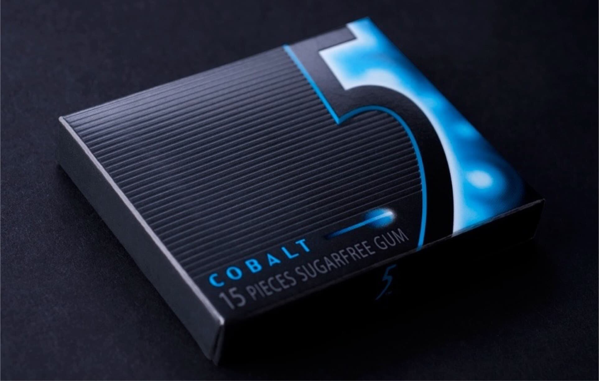
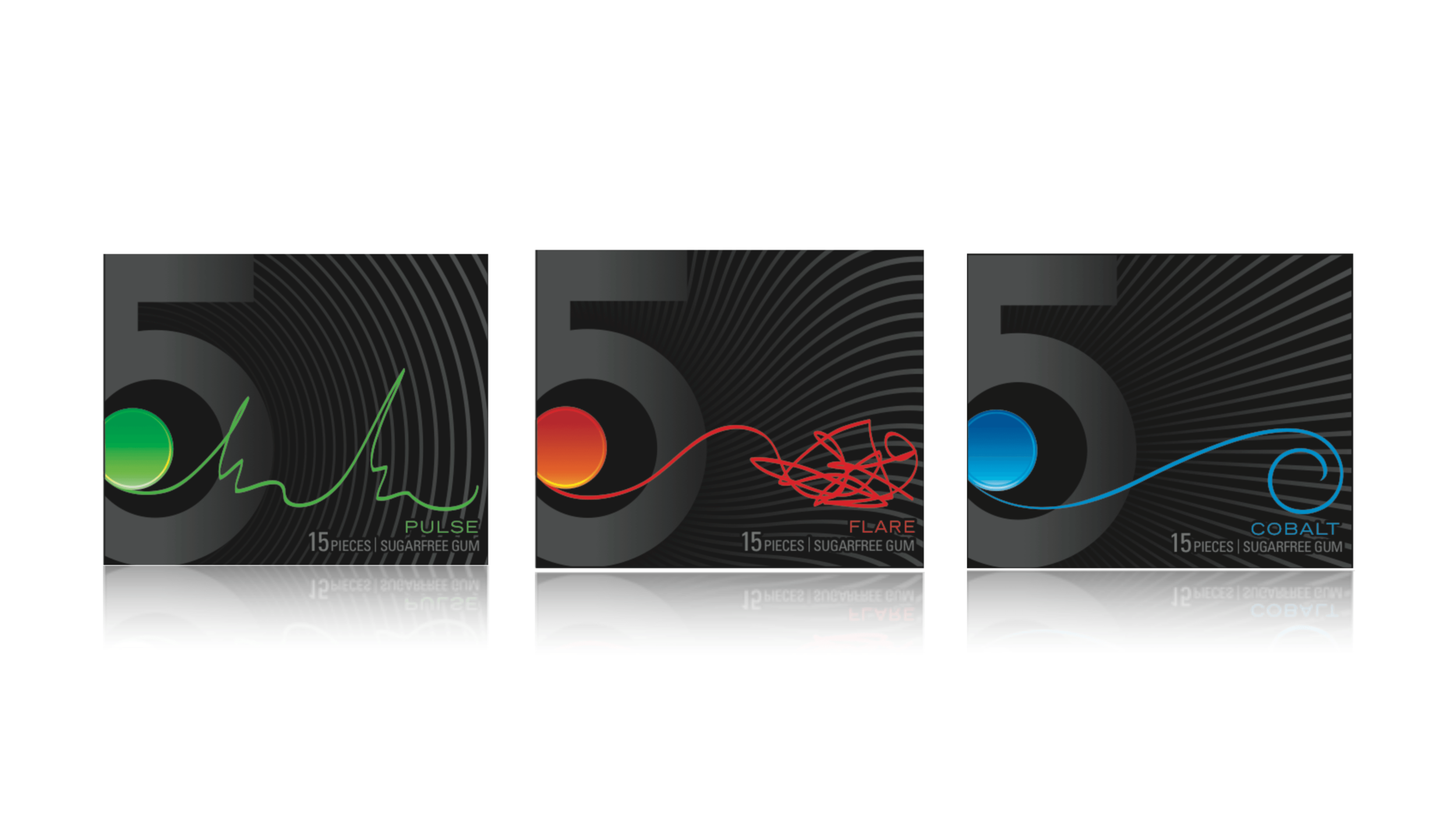
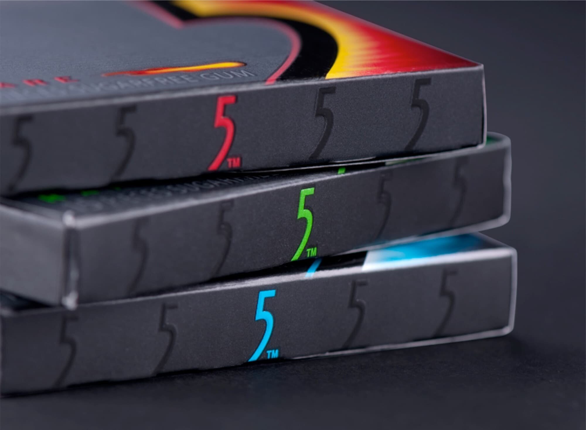
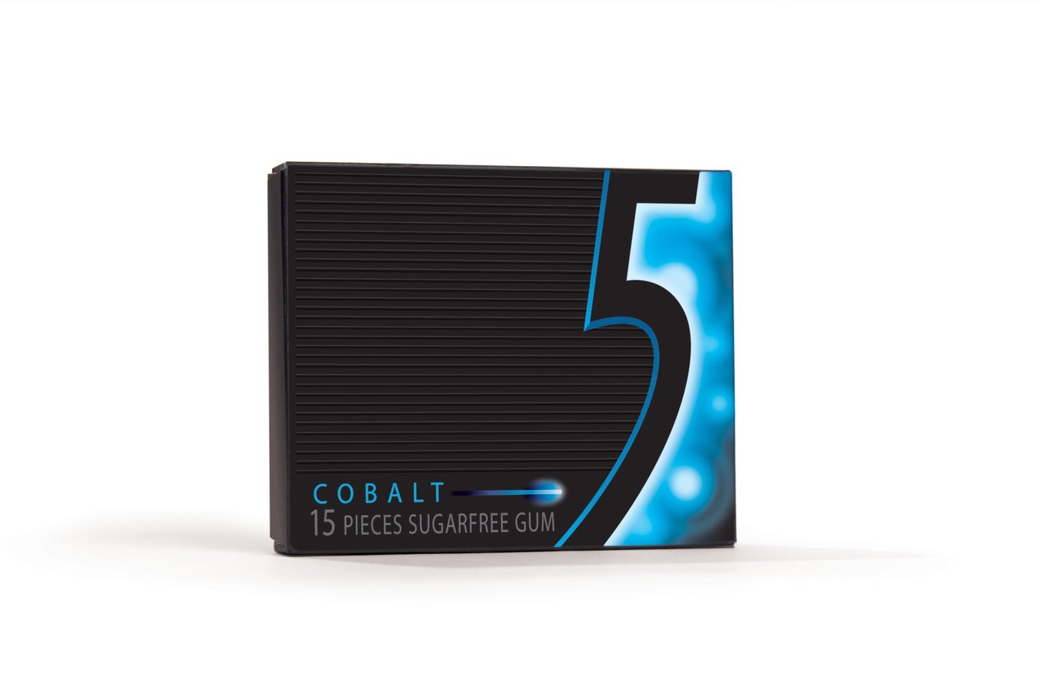
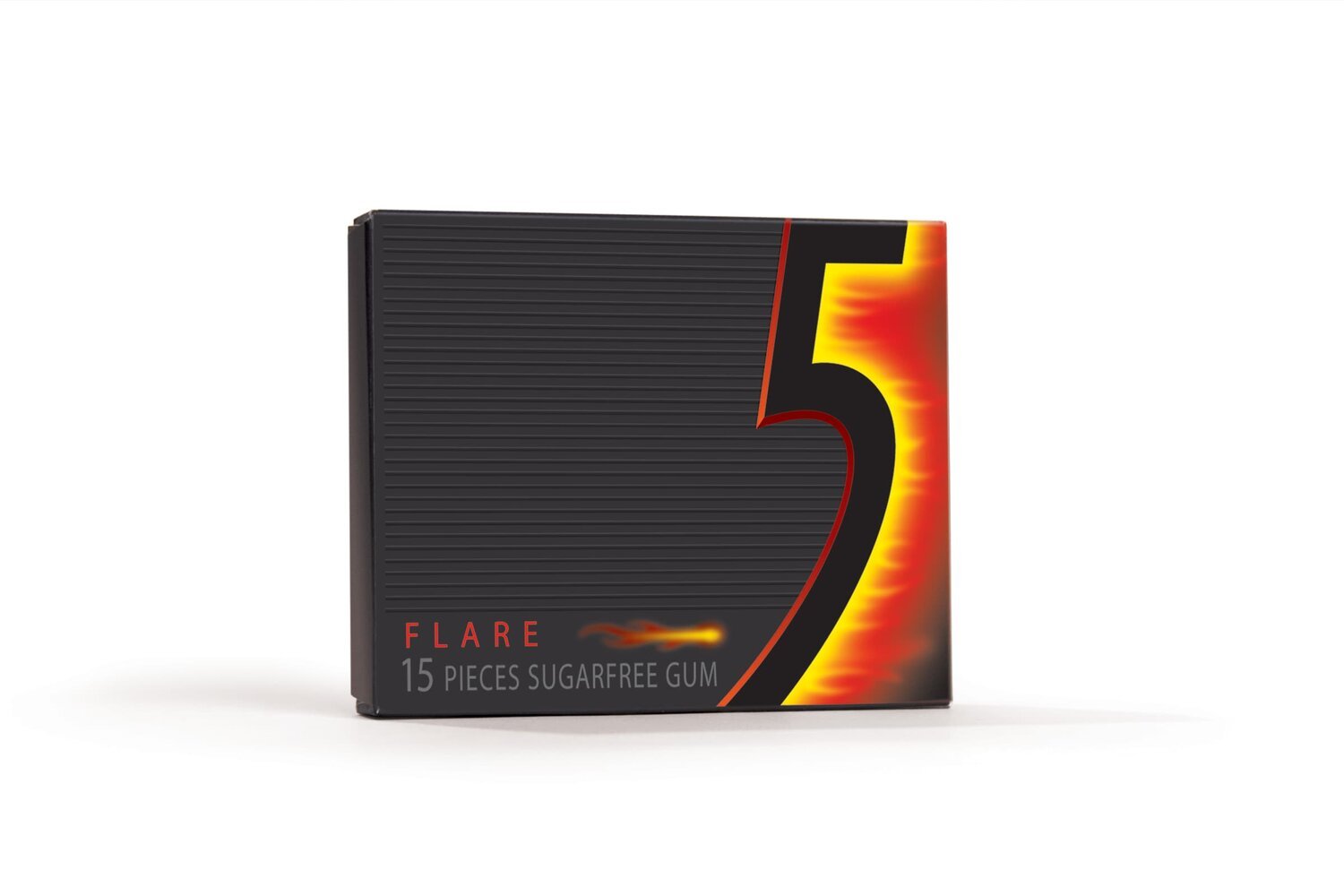
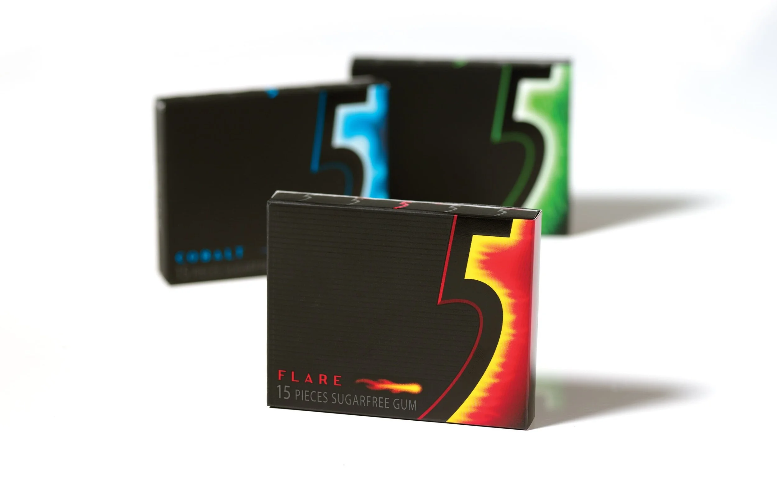
“Name it a symbol and make it black.” This became our battle cry as we set out to explore uncharted territory in the gum aisle. Being bold and attention grabbing was a must, but in a category oversaturated with vibrant colors screaming for consumers attention the opportunity existed to create a gaping black hole at shelf. Seizing this opportunity Baker developed a familial brand system of dramatic black packaging with strikingly bold accent colors – still delivering on the expectation of instensely satisfying flavors, while introducing an intriguing sense of mystery and contrast.

BRAND.ACTIVATE
Employing a bold wrought iron black (inspired by classic European architecture) each iconic talisman is designed to simply and memorably portray its respected variety while jestingly injecting a sense of deeper meaning into the brand’s rich story.
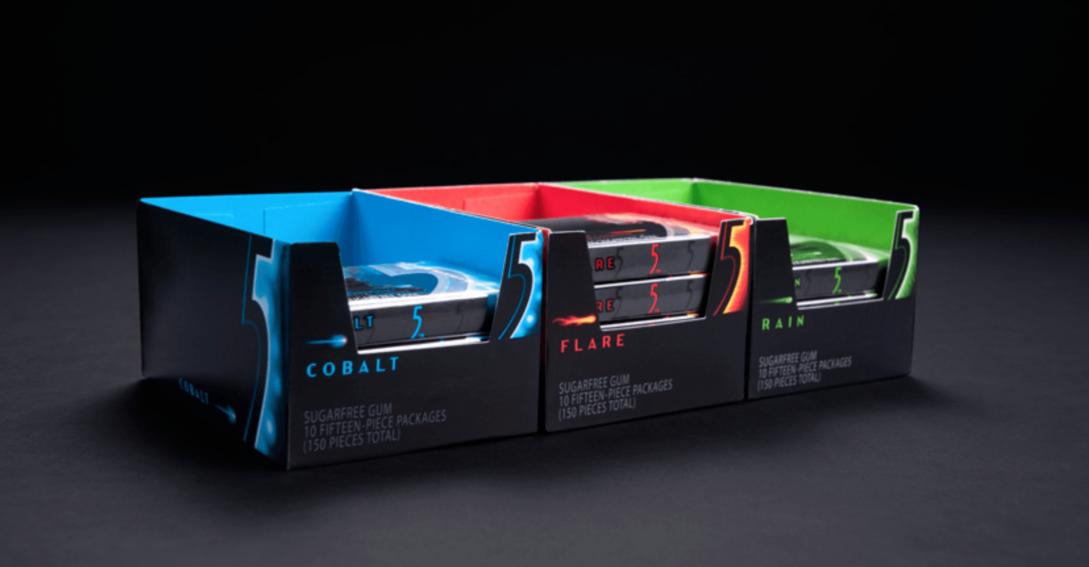
Building on the idea of “stimulating the 5 senses”, a variety of printing techniques were utilized to add physical and visual textures – debossed linework along with matte and glossy varnishes combined to amplify the touch and feel of the brand. To build suspense and stimulate the imagination, flavor names like Cobalt, Flare and Rain were selected over the more commonplace and unispiring Peppermint, Cinnamon and Wintergreen. Perhaps most importantly, as much legal housekeeping as possible was printed exclusively on the outer protective plastic wrapper, leaving the inner paperboard work of art untarnished by superfluous detractors – or as the teens who bought the gum put it “it’s just a cool pack”.
“Consumers were drawn to the new sleek black packaging and viewed it as innovative, modern, and slightly mysterious. Ultimately, 5’s journey was born from a combination of the look and feel of the pack, our Stimulation Junkie’s desire to experience new things, and our desire to create a world of storytelling and shared experiences. What our team developed is a dark, mysterious, almost sci‐fi playground, where teens could experiment with a new gum that would stimulate them.”
— Wrigley’s Case Study for the David Ogilvy Awards
Following the overwhelming success of the 5 Gum brand launch, the partnership betweeen Baker and Wrigley’s led to a 13% market share within the first 3 years on the shelf, an onslaught of flavor extensions and a slew of popular ads all building upon the initial brand concept of “stimulating the 5 senses.” In 2010 5 gum was named one of AdAge’s Hottest Brands cementing the William Wrigley Jr. Company’s legacy as perhaps the most iconic gum manufacturers in the world.
AWARDS
David Ogilvy Awards / Packaged Goods Gold Winner Graphic Design USA 2008
Named one of America’s Hottest Brands by AdAge
The Dieline Feature
Related Work
We are recognized as one of the The Best Branding Agencies, Best Brand Strategy Companies and Best Naming Agencies by DesignRush and TopBrandingCompanies.com!