
A BAKER CASE STUDY
Utepils Brewing
An intoxicating twist on tradition
The Twin Cities craft beer industry has been booming for years with no sign of decline on the horizon. Aware of this surge, as well as the increasingly stiff competition, our friends at Utepils decided to reach out to Baker with a slightly different approach to birthing a burgeoning brewery.
THE CHALLENGE
Rather than riding the trendy wave of hop-heavy, outrageously bitter brews that had been oversaturating the market as of late, Utepils chose to invoke inspiration in old world flavors and time-tested traditions passed down through generations of European brew masters. After all, who else in the world has more consistently proven that great beer and great company are a recipe for beer battered success? Perhaps only the good people of Minnesota and Wisconsin.


BRAND.THINK
With a great name in mind and an even better location, the team at Baker was challenged with conjuring up an exciting new twist on old world traditions. The client was resolute that a modern spin on historically derived design could concoct a classically rooted brewery brand that would masterfully marry the local Bryn Mawr neighborhood with elements of European culture… we wouldn’t have agreed more.
By focussing our efforts on a variety of concepts ranging from direct neighborhood nods to traditional European motifs, the Baker team was able to push each of the distinctly different branding notions into areas that respectfully challenged and delighted our clients beyond their wildest expectations.

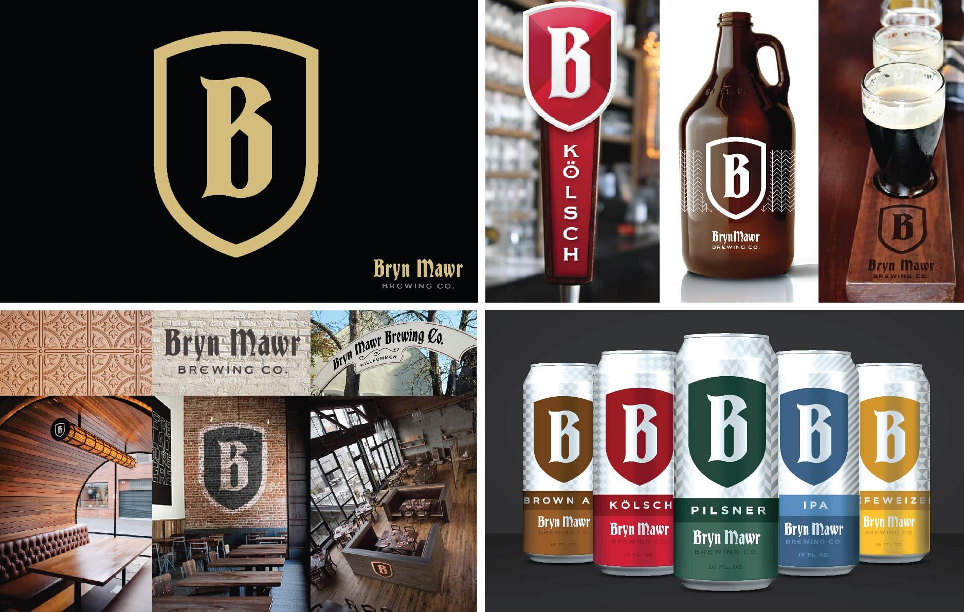
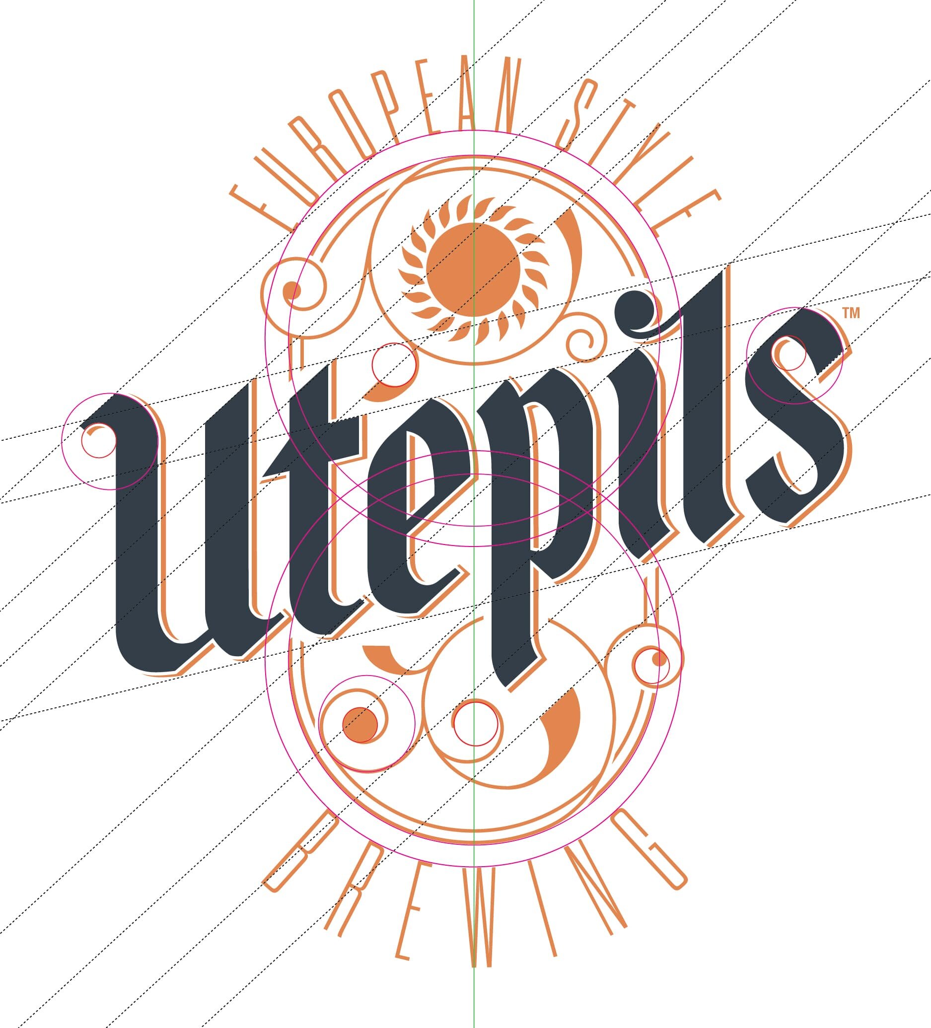
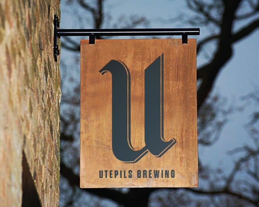
The selected design draws its inspiration from the well travelled bike trails that famously wind throughout the local Bryn Mawr neighborhood and artistically combines customized blackletter typography, hand drawn to reflect traditional European craftsmanship.

BRAND.BUILD
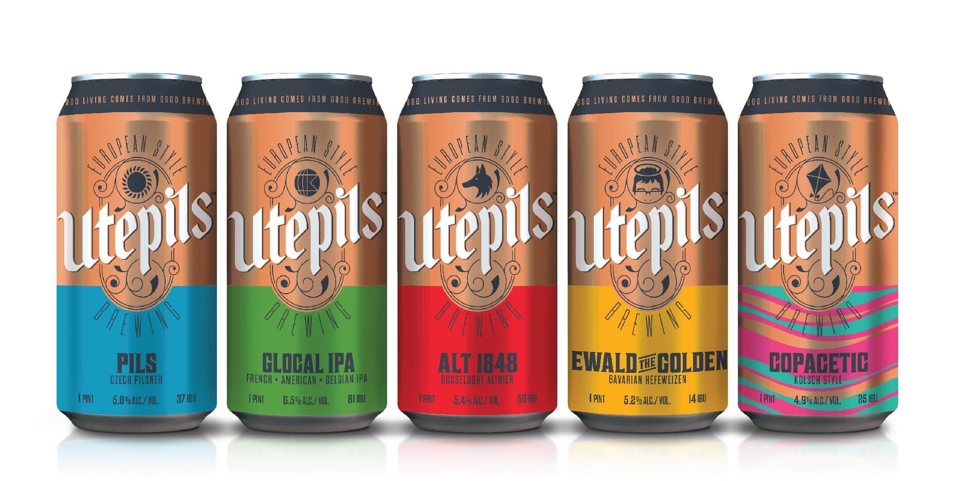
To maximize shoppability while optimizing the cans ability to stand out on shelf, the design was kept to a minimal simplicity that contrasts nicely with the surrounding noise created by a cacophony of competitors. The simple 2-level shopping experience helps consumers find their beloved copper brand on shelf, then select from their choice of variety identified by a playfully vibrant flavoring system.


After raising $1.2M from investors with the brand identity created by BAKER, the Utepils Investment Group encountered a significant set back in realizing their dream of launching the Bryn Mawr Brewing brand. Due to legal complications the Bryn Mawr name was unfortunately no longer available. The new name – Utepils Brewing – harkened back to the investments groups’ original obsession, the idea of sharing an “Utepils Moment” – a Norwegian tradition of enjoying the first beer of spring outside with friends after a long winter.
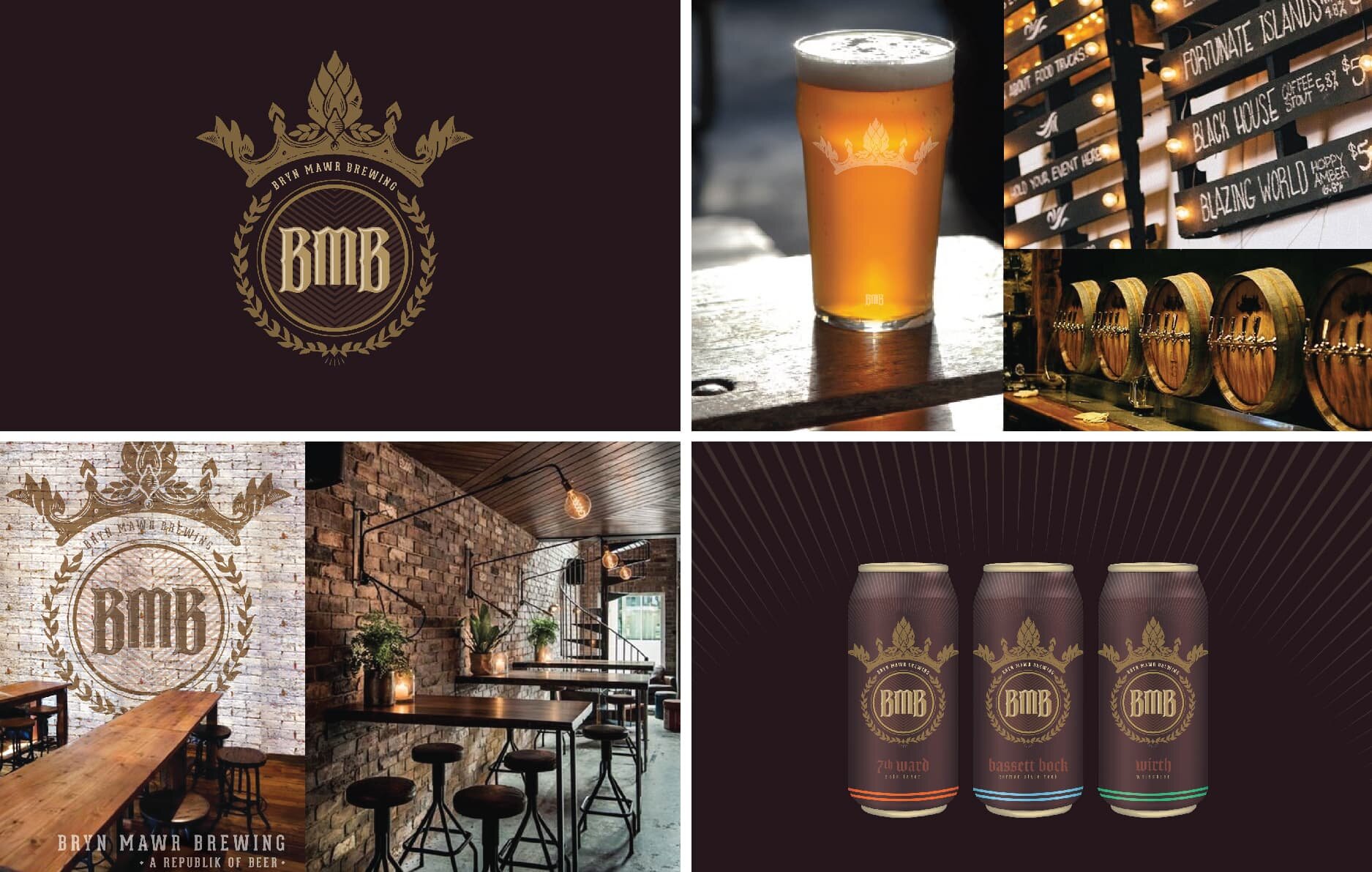
Not wanting to throw the baby out with the bathwater, the Baker team set to work strategizing a new path forward. To help clarify and refocus the teams efforts, a new visual positioning board was adopted retaining many of the original influences investors had so admired while incorporating some newer, more quirky design elements that paired well with the new brand concept. Harnessing the original copper coloration as our nucleus, a new identity was forged that maintains emphasis on the old world European traditions in its letterforms, but adds a level of playful nuance in the brands finer details.
Rework.
Not rethink.
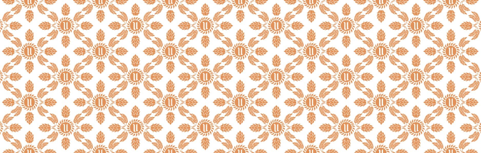
Utilizing the same gridwork as the original design chassis, new letterforms were completely redrawn to convey an identical feeling as those created for the previous name. Enhancing the personality of flavor system further, the signifying talisman associated with each distinct flavor was moved to a more marquee position – the top of the branding where they can more proudly carry notable visual weight when distinguishing between a multitude of varieties.


Employing a bold wrought iron black (inspired by classic European architecture) each iconic talisman is designed to simply and memorably portray its respected variety while jestingly injecting a sense of deeper meaning into the brand’s rich story.

BRAND.ACTIVATE
Employing a bold wrought iron black (inspired by classic European architecture) each iconic talisman is designed to simply and memorably portray its respected variety while jestingly injecting a sense of deeper meaning into the brand’s rich story.

Follow through.
From signage, to posters, to apparel, Baker developed a cohesive branding system that nimbly adapts to virtually any application without ever losing identity of the core Utepils experience.


For the complete, ever-evolving Utepils experience visit our friends at the Utepils Brewing taproom and enjoy one of their many intoxicating twists on European old world traditions.
We are recognized as one of the Top Beer Branding Agencies by DesignRush!
Related Work


